Graphical Summary
To compare two groups on a categorical variable, the best graph to use is a segmented bar graph, where each explanatory variable group has its own column and shows the conditional distribution of the response variable within each group.
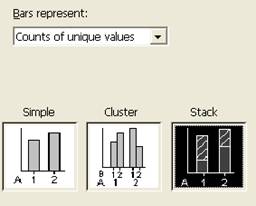
(c) Use technology to create a segmented bar graph comparing the yawning rates between the two groups:
|
- Select the third option, “Stack”
|
 |
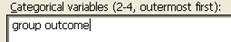
- To put the explanatory variable along the horizontal axis (ALWAYS) specify the column containing the explanatory variable first, and then the column containing the response variable. Here double click on C1 then C2 to place them in the Categorical variables box in that order.
|
 |
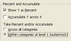
- Press the Chart Options button and then check the “Show Y as Percent” box and then Accumulate “Within categories” at level 1.
- Press OK twice.
|
 |
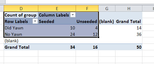
- Use your mouse to select the row and column lables and the inside of the table (not the blanks or totals). [If this doesn't work with your (older) version of Excel, you may just need to copy and paste the values of the table into a different location and mouse over that rather than the pivot table.]
|
 |
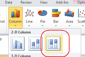
- Select Insert >Column
- And then select the 100% stacked column option (the last option in the first row).
The graph should now appear. If the explanatory variable does not appear along the horizontal axis, then use the "Switch Row/Column" button at the top. If the blanks appear, you should be able to use the pull-down menu with the row or column labels to uncheck that box and press OK.
|
|
Copy and paste your graph in the designated area of your lab report. Then return here and press Next for further instructions.