Descriptive Statistics

Graphical Summary

For these data, a simple bar graph can be most effective. Excel makes graphs that are easy to customize.

Optional Video Instructions: Click here and follow the instructions provided to see how to create the graph.


Written Instructions:

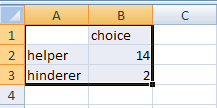
  • In Excel, highlight the 2 columns and 3 rows of information by clicking in A1 and mousing over.

bar graph step 1
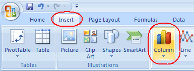
  • In Excel 2007, choose the Insert menu and then select the Column chart (shown to the right).

In Excel 2003, choose Insert > Chart.

bar graph step 2
  • Then from the Column menu/Chart Wizard, select the first option: "Clustered Column"

(In Excel 2003, press finish.)

bar graph step 3
  • Note you can change the colors and labeling. At least: click on the Layout tab and then use the pull down menu to add Axis Titles. Also click on the Design tab and select other Chart Laouts.

excel

excel

bar graph step 4

Saving the Graph:

(b) Copy and paste this graph (after modifying labels etc.) into your Word file (e.g., select Edit > Copy Graph or CTRL-C) and then switch to Word and press CTRL-V (or Edit > Paste or in Word 2007 you can click on the Paste icon).

paste icon

Back Next