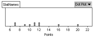
Most of the points were between 7 and 12, with no real peak. There are two noticeable outliers, Nightingale with 16 points and Blackwell with 20 points.
(c)
Most of the points were
between 7 and 12, with no real peak. There are two noticeable outliers,
Nightingale with 16 points and Blackwell with 20 points.
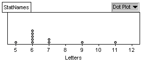
(d) Most letters: Nightingale; Most points: Blackwell, not the same
person
(e) Fewest letters: Tukey with 5; fewest points: Gosset and Galton
with 7 points; not the same person.
(f)
(g)
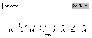
The ratio values are much
more evenly "spread out", ranging from 1 to 2 points/letter.
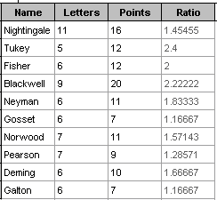
(h) The highest ratio at 2.4 belongs to Tukey. He didnt have very many
letters but some of them were pretty valuable. People like Nightingale
have lots of points but thats not so surprising considering the number
of letters.
(g)
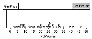
A little under 25% women
seems typical, e.g. pediatric cardiology (24.2%)
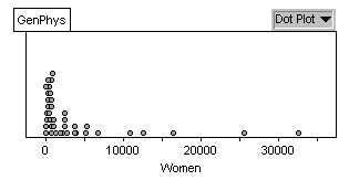
(h) Emergency medicine has 3662 women but are only 17% of the overall
number in emergency medicine. Can you find a more extreme example?
(i) Medical genetics have a small number of women (103) but make up
41% of all specialists in this area. Again, there are numerous combinations.
(j) Describing the dotplot: The distribution is fairly symmetric, centered
roughly between 20 and 25%.. The highest percentage is pediatrics with
46% women.
(k) It can be very difficult to compare "counts". Since the number
of physicians varies so much from specialty to specialty, the number of
women can be misleading if we want to know more about the gender breakdown
between the specialties, e.g. which specialities have "a lot of women"
or which specialties are women more likely to choose?
(c) - (e) Answers will vary from student to student.
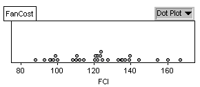
(f) highest: N.Y. Mets, $3.50; lowest: Philadelphia, $1.25
(g) The term "small" is relative to the ballpark. The size of
a "small" soda varies from ballpark to ballpark.
(h) highest: Boston, $0.18 per oz.; lowest: Montreal, $0.08 per
oz.
(d)
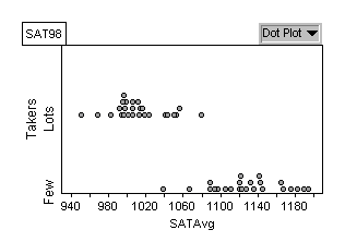
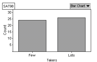
The SAT averages for states
that had more than 25% of high school seniors take the exam appears reasonably
mound shaped, centered around 1000. The SAT averages for states that had
less than 25% of high school seniors take the exam also looks reasonably
mound shaped, but centered much higher, around 1120. In fact, there
is not much overlap between the two distributions.
One explanation could be
that in states where not a high proportion of students take the SATs, those
students that do may tend to be the college bound students and may not
represent the performance for all students in the state (especially states
that tend to use the ACT scores instead). When a higher proportion
of students take the SATs, the average will describe a much more diverse
population, lowering the overall averages for those states.
(e) A high average may not be a good indicator of how well the state
prepares students for the exam (and college). As more students take the
exam, its likely this will reduce the overall average. So, a high
average for a state may simply result from a low percentage of people taking
the exam.
(f) Answers will vary from student to student.