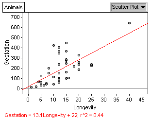
(d) For each addition year of the animal's longevity, its gestation period is longer by 13.1 days.
(e) .439
(f)
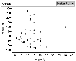
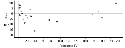
It seems as though the predictions are generally closer when the longevity is very small.
(b) Fitted value: 22 + 13.1(20) = 284; Residual: -97
(d) For each addition year of the animal's longevity, its gestation
period is longer by 13.1 days.
(e) .439
(f)
It seems as though the predictions
are generally closer when the longevity is very small.
(g) This should produce the same graph you created in (f) (you may have
to enlarge it to see it better).
(h)
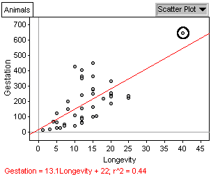
The elephant (residual =
98.23) is an outlier in both longeviy and gestation. There are 6
other animals with larger positive value residuals, and 6 other animals
with larger negative value residuals. So no, the elephant, while
being extreme in longevity and gestation, does not have the largest residual.
(i) The giraffe has the largest residual. Its gestation period
is much longer than would be expected for an animal of its longevity.
(j) regression line: gestation = 9 + 13.6 * longevity; r2
= .501
(k) This regression line with the giraffe omitted is not substantially
different from the original one.
(l) regression line: gestation = 45 + 11.1 * longevity; r2
= .269
(m) The removal of the elephant affected the regression line much more
than the removal of the giraffe.
(n) Changing the gestation of the elephant (an animal with an extreme
longevity) has a very large effect on the regression line, as compared
to changing the gestation period of any other animal with a more typical
longevity, which doesn't have that much of an effect on the regression
line. Thus, the regression line is especially not resistant to outliers
that are extreme in the horizontal direction.
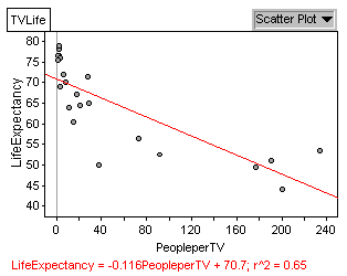
(d)
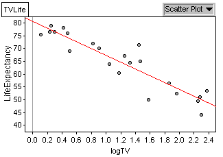
new regression equation:
life expectancy = 80.6 - 13.3 * logTV; The transformation has made
the scatterplot much more linear, and has greatly improved the fit of the
regression line.
(e) .850
(f) 67.3
(g) 54; difference = 13.3, the slope coefficient. Since
the horizontal axis is logarithmic, a change of one on the horizontal scale
is actually a change by a factor of 10 in the number of people per TV.
So, since the number of people per TV changes by a factor of 10 from (f)
to (g), it is changing by one unit on the horizontal scale, and thus the
life expectancy simply increases by the slope coefficient.
(h)
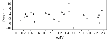
This scatterplot reveals
no clear pattern.
(i) The linear regression model is a better fit with the transformed data.