Activity 2-1:
(b)
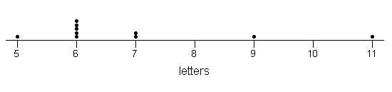
(c) Most of the names were 6 letters. There were a few names that were
noticeably longer, Blackwell with 9 letters and Nightingale with 11 letters.
(d)
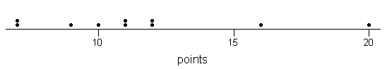
Most of the points were between 7 and 12, with no real peak. There
are two noticeable outliers, Nightingale with 16 points and Blackwell with
20 points.
(e) Most letters: Nightingale; Most points: Blackwell, not the same
person
(f) Fewest letters: Tukey with 5; fewest points: Gosset and Galton
with 7 points.
(g)
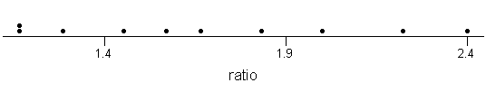
The ratio values are much more evenly "spread out," ranging from 1
to 2 points/letter.
(h) The highest ratio at 2.4 belongs to Tukey. He didnt have very
many letter but some of them were pretty valuable. People like Nightingale
have lots of points
but thats not so surprising considering the number of letters.
<<Use your browser's "Back" button to return to the main solutions
page>>
Activity 3-5 (cont):
(e) The graph should resemble the given histogram. We see two
clusters, one centered around 52 minutes and one around 79 minutes.
(f) The different subinterval widths change the histogram's appearance
dramatically. With 5 subintervals the two clusters are not apparent, and
with 20
subintervals the distribution looks very jagged. The most informative
picture is probably the histogram with 10 subintervals.
<<Use your browser's "Back" button to return to the main solutions
page>>
Activity 6-2 (cont.):
(f)
|
min
|
Q1
|
median
|
Q3
|
max
|
|
PGA
|
1258745
|
1477245
|
1674819
|
2035231
|
6616585
|
|
LPGA
|
296347
|
364441
|
491200
|
604024
|
1591959
|
|
Seniors
|
631046
|
735064
|
969925
|
1130577
|
2515705
|
These five number summaries differ from those calculated by hand for 2
reasons: First, Minitab has actual dollar amounts, not rounded to the nearest
thousand, and also Minitab uses a slightly different formula for calculating
quartiles.
(g)
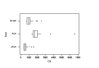
(h) Yes, the modified boxplots show the outliers and also how close
the non-outliers come to them (or how far they are in the PGA case!).
(i) The boxplots reveal that the PGA golfers tend to make the most,
followed in order by the Seniors and then the LPGA golfers. This difference
is exemplified
by the realization that the lowest money winner among the PGA top 30
would be a high outlier among the LPGA top 30. Also, the lowest money winner
among
the Seniors' top 30 is higher than the upper quartile among the women's
top 30. The PGA winnings show the most variability (widest box). All three
distributions of earnings are skewed to the right (lower quartile is closer
to median than upper quartile).
<<Use your browser's "Back" button to return to the main solutions
page>>
Activity 9-1
(a)-(c)
| |
strongly positive
|
|
mildly positive
|
|
virtually none
|
|
mildly negative
|
|
strongly negative
|
|
letter:
|
B
|
F
|
I
|
E
|
C
|
H
|
A
|
G
|
D
|
|
r
|
.994
|
.889
|
.51
|
.235
|
-.081
|
-.244
|
-.45
|
-.721
|
-.907
|
(d) largest: 1; smallest: -1
(e) Correlations of 1 or -1 occur when the observations pairs form
a straight line.
(f) A positive correlation indicates a positive association.
A negative correlation indicates a negative association
(g) Correlation values near + 1 are strong, while values near
0 are weak.
(h) There appears to be a strong association.
(i) r = .257; This value seems to indicate a relatively
weak positive relationship. This is not consistant with our answer
for (g). This happened because r measures the strength of
the linear association. While these variables are clearly related,
they are not linearly related.
(j) r = .507; This indicates a moderate positive association,
though one would not guess this from the scatterplot.
<<Use your browser's "Back" button to return to the main solutions
page>>
Activity 10-2: Airfares (cont.)
(a)
| |
|
mean |
std. dev |
| airfare (y) |
|
166.9 |
59.5 |
| distance (x) |
|
713 |
403 |
r = .795
(b) b =.795(59.5/403) = .117; a = 166.9-.117(713) = 83.479
(c) airfare = 83.479 + .117 * distance
(d) airfare = 83.479 + .117 * distance
(e) 83.479+.117(300) = $118.58
(f) $258.98
(g)-(h)
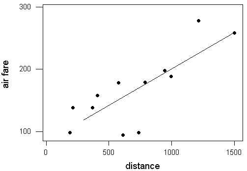
(i)Answers will vary from student to student, but a good estimate would
be $190.
(j) $188.78
(k) $415.99; This is probably not a reliable estimate since a
distance of 2,842 miles is well beyond our data set.
(l)
| distance |
900 |
901 |
902 |
903 |
| predicted airfare |
$188.78 |
$188.89 |
$189.01 |
$189.13 |
(m) Each mile adds about another $0.11, which is close to the slope
of our least squares regression line, .117.
(n) $11.70
<<Use your browser's "Back" button to return to the main solutions
page>>
Activity 17-1: Coin Ages (cont.)
(a)
| size |
mean |
std. dev |
min |
Q1 |
median |
Q3 |
max |
| 1000 |
12.264 |
9.613 |
0 |
4 |
11 |
19 |
59 |
(b)
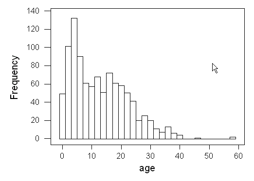
(c) observational units: pennies; variable: age, quantitative
(d) parameters; mean: m; standard
deviation: s
(e) Students' answers to (e)-(m) may differ since
the data are chosen randomly. These are meant to be sample answers.
13, 24, 17, 0, 0
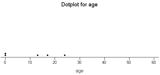
(f) 10.8
(g)
|
Sample no.
|
1
|
2
|
3
|
4
|
5
|
|
Sample mean
|
10.8
|
13
|
5.8
|
12.8
|
17.8
|
(h) No, this is an example of sampling variability. This is a quantitative
variable, rather than a categorical one.
(i) mean of  values: 12.04; standard deviation of x-bar values: 4.33
(j) This mean is reasonably close to the population mean. This
standard deviation is less than the population standard deviation.
(k)
(l) This distribution appears to centered near the population mean
of 12.264. The values are less spread out than the population distribution
and the five sample means of size 5.
(m) yes
<<Use your browser's "Back" button to return to the main solutions
page>>