(e) The graph should resemble the given histogram. We see two clusters, one centered around 52 minutes and one around 79 minutes.
(f) The different subinterval widths change the histogram's appearance
dramatically. With 5 subintervals the two clusters are not apparent, and
with 20
subintervals the distribution looks very jagged. The most informative
picture is probably the histogram with 10 subintervals.
<<Use your browser's "Back" button to return to the main solutions page>>
Activity 9-1: Properties of Correlation (cont.)
Note, to calculate the correlations with the TI,
cars that had any missing values were first deleted from the data set.
This leaves 72 cars.
| strongly positive | mildly positive | virtually none | mildly negative | strongly negative | |||||
|
|
|
|
|
|
|
|
|
|
|
|
|
|
|
|
|
|
|
|
|
|
<<Use your browser's "Back" button to return to the main solutions page>>
Activity 10-2: Airfares (cont.)
(b)
| mean | std. dev | ||
| airfare (y) | 166.9 | 59.5 | |
| distance (x) | 713 | 403 |
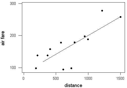
(k) Answers will vary from student to student, but a good estimate would
be $190.
(l) $188.78
(m) $415.99; This is probably not a reliable estimate since a
distance of 2,842 miles is well beyond our data set.
(n)
| distance | 900 | 901 | 902 | 903 |
| predicted airfare | $188.78 | $188.89 | $189.01 | $189.13 |
(o) Each mile adds about another $0.11, which is close to the slope
of our least squares regression line, .117.
(p) $11.70
<<Use your browser's "Back" button to return to the main solutions page>>
(j) sum of squared residuals: $14,308.09;
(k) sum of squared deviations from overall mean: $38,882.92
(l) .632
(m) .632; This is the same as the proportion of variability in
the response variable that is explained by the regression model.
<<Use your browser's "Back" button to return to the main solutions page>>
Activity 10-4 (cont.)
(c) Yes
(d) The line on the private college scatterplot appears to do a better
job of summarizing the relationship between tuition and founding year.
The points follow the linear relationship much more closely.
(e) public: $5,083; private: $14,229; Judging from the
scatterplot, the private school prediction seems more reasonable because
the points fall closer to the line in the area of 1900 on this scatterplot.
<<Use your browser's "Back" button to return to the main solutions
page>>