Math 37 - Lecture 24
More than one variable (Ch. 2)
Before usually just had one variable of interest (e.g. Mean time difference, Proportion who favor Coke). What if we have two (bivariate) or more variables? We can describe them individually, but more importantly, examine the relationship between them.
Examples: Are they related?
- SAT scores and freshman GPA - Sex and Degree
- Weight and Height - Smoking and Cancer
Review - Variable types, explanatory vs. response variables
GRAPHICAL SUMMARIES
- Frequency Tables, Segmented Bar Graphs are used to describe the relationship between two categorical variables.
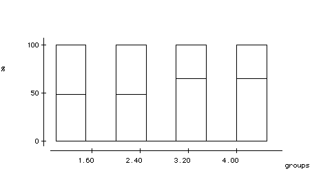
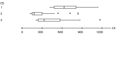
- Side by Side Boxplots can describe patterns between one categorical and one quantitative variable. (e.g. two-sample t-tests)
- Scatterplots are used to display the relationship between two quantitative variables.
One variable on horizontal axis, one on vertical. Measure both
variables on each individual. Each individual appears as one point in the plot. Can use different symbols (tags) to show the effect of a categorical variable. If there is an explanatory variable, always put the explanatory variable on the horizontal axis.
Example Manatees are a large, gentle sea creature living along the Florida coast. Many manatees are killed or injured by powerboats.
Explanatory Variable =
Response Variable =
Scatterplot: How describe the relationship?
Interpreting Scatterplots:
1) Look for overall pattern
direction form strength
2) Look for deviations from overall pattern
Outliers - any individual observation that falls outside the overall pattern of the graph.
Direction:
Positive Association: Two variables are positively associated when high values on first variable occur with high values on second variable, and low values occur with low values.
e.g. Students with higher SAT scores tend to have higher frosh GPAs
Negative Association: Two variables are negatively associated when high values of one variable occur with low values of the other, and vice versa.
e.g. People who smoke tend to have shorter life spans.
Overall Pattern: To describe a scatterplot, state the direction (positive or negative), form (is it linear?), how strong the relationship appears (how large is the scatter), and identify any outliers.
Problems with Scatterplots
- Changes in scale can drastically effect the picture presented.
NUMERICAL SUMMARY
If the relationship between two quantitative variables is linear,
the correlation coefficient measures the strength and direction of the relationship.
Notation: Let x1,...,xn be n observations for the first variable.
Let y1,...,yn be n observations for the second variable.
![]() , sx are the mean and standard deviation for variable 1
, sx are the mean and standard deviation for variable 1
![]() , sy are the mean and standard deviation for variable 2
, sy are the mean and standard deviation for variable 2
Formula:
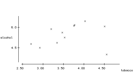
Example Is there a relationship between the average weekly household spending, in British pounds, on tobacco products and alcoholic beverages for each of the 11 regions of Great Britain?
|
Region |
Alcohol |
Tobacco |
|
North |
6.47 |
4.03 |
|
Yorkshire |
6.13 |
3.76 |
|
Northeast |
6.19 |
3.77 |
|
East Midlands |
4.89 |
3.34 |
|
West Midlands |
5.63 |
3.47 |
|
East Anglia |
4.52 |
2.92 |
|
Southeast |
5.89 |
3.20 |
|
Southwest |
4.79 |
2.71 |
|
Wales |
5.27 |
3.53 |
|
Scotland |
6.08 |
4.51 |
|
N. Ireland |
4.02 |
4.56 |
Properties:
Example Predict the correlation coefficient between Math 37 students' midterm 1 and midterm 2 scores. Interpret this value.
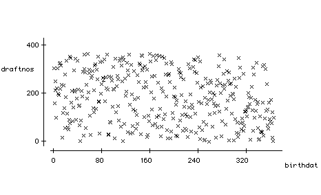
Example Was there a relationship between the draft lottery number assigned in 1970 and the males' birth date?
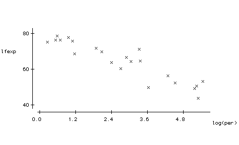
Example For 22 countries, recorded their life expectancy and the number of people per television set in each country.
|
Country |
Life exp |
Per TV |
Country |
Life exp |
Per TV |
|
Angola |
44 |
200 |
Mexico |
72 |
6.6 |
|
Australia |
76.5 |
2 |
Morocco |
64.5 |
21 |
|
Cambodia |
49.5 |
177 |
Pakistan |
56.5 |
73 |
|
Canada |
76.5 |
1.7 |
Russia |
69 |
3.2 |
|
China |
70 |
8 |
S. Africa |
64 |
11 |
|
Egypt |
60.5 |
15 |
S. Lanka |
71.5 |
28 |
|
France |
78 |
2.6 |
Uganda |
51 |
191 |
|
Haiti |
53.5 |
234 |
UK |
76 |
3 |
|
Iraq |
67 |
18 |
US |
75.5 |
1.3 |
|
Japan |
79 |
1.8 |
Vietnam |
65 |
29 |
|
Madagascar |
52.5 |
92 |
Yemen |
50 |
38 |
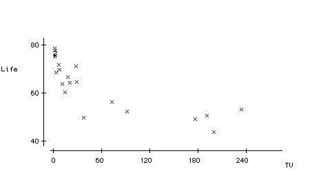
(a) Does there appear to be an association between the two variables?
MTB > corr c1 c2
Correlation of Life and TV =-0.804 -.922
(b) What would you tell someone who concludes that sending TVs to countries with lower life expectancies will cause their inhabitants to live longer?
Association vs. Causation
Correlation measures association.
CORRELATION DOES NOT IMPLY CAUSATION!
- May be a third variable influencing both of yours
- May be a lurking/confounding variable
- To determine causation, you must
Example
|
x |
10 |
8 |
13 |
9 |
11 |
14 |
6 |
4 |
12 |
7 |
5 |
|
y |
7.46 |
6.77 |
12.74 |
7.11 |
7.81 |
8.84 |
6.08 |
5.39 |
8.15 |
6.42 |
5.73 |
- Calculate the correlation coefficient (find mean and SD for x and y)
- Construct the scatterplot, describe the association