Graphical Summary
To compare two groups on a categorical variable, the best graph to use is a segmented bar graph (see p. 263 in text) where each explanatory variable group has its own column and shows the distribution of the response variable within each group.
(e) Use the applet below to create bar graphs comparing the yawning rates between the two groups.
You can enter the two-way table of counts into the Sample data box.
- Press Clear.
- Type in the four cell counts
- Group A = Yawn Seed
- Group B = No Seed
- Success = Yawn
- Failure = No Yawn
- Press Use Table.
- Check the Show table box to confirm your data entry and conditional proportion calculations.
|
|
- Return to the original data table (with the yawn/no yawn and seed/no seed columns)
- Choose Analyze > Distribution.
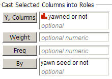
- Move the yawned or not variable into the Y, Columns box and move the yawn seed or not variable into the By box.
- Press OK.
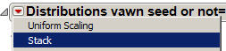
- Use the pull-down arrow from the first Distributions yawn seed or not = Seeded bar and select Stack.
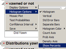
- Then use the pull-down arrow for the yawned or not bar and select Histogram Options > Separate bars and then Histrogram Options > Show Percents.
- Repeat for the Unseeded group
.
| 
 |
|
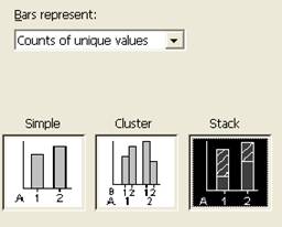
- Select the third option, “Stack”
|
 |
- To put the explanatory variable along the horizontal axis (ALWAYS) specify the column containing the explanatory variable first, and then the column containing the response variable. Here double click on C1 then C2 to place them in the Categorical variables box in that order.
|
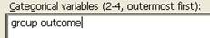 |
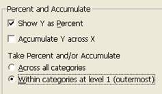
- Press the Chart Options button and then check the “Show Y as Percent” box and then Accumulate “Within categories” at level 1.
- Press OK twice.
|
 |
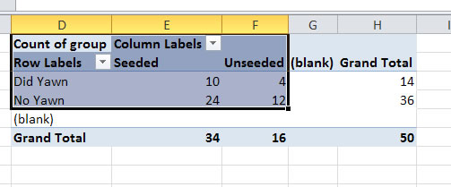
- Use your mouse to select the row and column lables and the inside of the table (not the blanks or totals). [If this doesn't work with your (older) version of Excel, you may just need to copy and paste the values of the table into a different location and mouse over that rather than the pivot table.]
|
 |
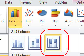
- Select Insert >Column
- And then select the 100% stacked column option (the last option in the first row).
The graph should now appear. If the explanatory variable does not appear along the horizontal axis, then use the "Switch Row/Column" button at the top. If the blanks appear, you should be able to use the pull-down menu with the row or column labels to uncheck that box and press OK.
|
|
Copy and paste your segmented bar graph in the designated area of your lab report. In the Word file, you should write a sentence introducing the graph output to the reader (or at least give it a nice title). Then return here and press Next for further instructions.