Example 6:
Comparisons and Association
(a) For the following research questions, indicate whether a chi-square analysis, analysis of variance, or regression analysis would be the appropriate approach. Also state a null and an alternative hypothesis for each question.
Scenario 1: A student wants to see if the average lifetimes of notable personalities from 9 different occupations differ significantly across these occupations.
Scenario 2: A sportswriter wants to compare the proportion of seven-game playoff series that are won by the home team across the major sports leagues (Major League Baseball, National Hockey League, and National Basketball Association) to see if the “home team advantage” varies significantly across the 3 leagues.
Scenario 3: A physical education teacher wants to determine if there is a significant relationship between 7th graders’ times to run a mile and how many push-ups they can do under controlled conditions.
(b) Carry out the appropriate analysis for each of these research questions. Remember to define any parameters, state hypotheses, comment on technical conditions, report the test statistic and p-value, and draw your conclusion in context. Your conclusion should include discussion of the relevant population and whether you can draw cause and effect conclusions based on the study design.
Data for Scenario 1: Can be found in lifetimesFull.mtw. These data are from The 1991 World Almanac and Book of Facts which contained a section on “noted personalities” in several categories such as “noted writers of the past” and “noted scientists of the past.”
Data for Scenario 2: Through 2003, 23 of the 44 major league baseball playoff series that went to the full length of seven games were won by the home team, compared to 70 of 111 seven-game series in hockey, and 70 of 85 seven-game series in basketball. Consider these observations as representative of the general “playoff series process” in each league.
Data for Scenario 3:
Can be found in PEClass.mtw. These data were collected by a physical
education instructor at a junior high school in
Analysis:
(a) Scenario 1: To compare several population means (average lifetimes), we will use ANOVA.
Scenario 2: To compare the probability of success (wining the series) across 3 leagues, we will use Chi-square.
Scenario 3: To examine the association between two quantitative variable, we will use regression.
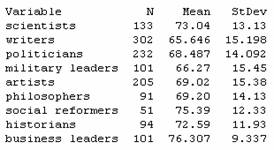
(b) Scenario 1: To compare several groups on a quantitative response variable, we will consider Analysis of Variance. The first step will be to describe the data we have. In lifetimes.mtw is the lifetimes (years) of notable personalities from 9 different occupation classifications as reported in The World Almanac and Book of Facts. The samples were selected independently from within each job classification but they were presumably not selected at random. Thus, we should be cautious in how we generalize our conclusions. We will need to restrict our conclusions to “notable personalities” but otherwise might not suspect any bias in the World Almanac’s sampling method. In this case, we can define mi to be the population mean lifetime for all notable personalities with occupation i.
H0: mscientist = mwriters =mpoliticians =mmilitary =martists =mphilos =msocial =mhistorians =mbussiness
Ha: at least one population mean lifetime differs from the rest
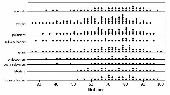
Numerical and graphical summaries do reveal some differences across the groups.
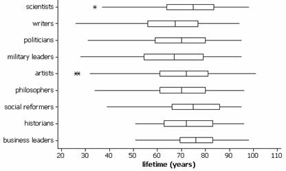
There is a slight tendency for longer lifetimes among scientists and business leaders and for shorter lifetimes among writers and military leaders. However, there is a fair bit of variation within the groups and much overlap in the boxplots.
To see if an ANOVA procedure is valid, we check the technical conditions:
· Dotplots of the individual samples do not reveal any marked departures from normality.
· The ratio of the largest to smallest standard deviations (15.45/9.34) is less than 2 so we will assume that the population variances are equal.
· We have independent samples from each population though the randomness condition is questionable.
While we do not have randomness in this study, we will still explore whether the difference between the sample means is larger than we would expect by chance.
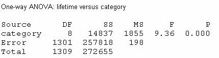
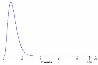
The large test statistic F=9.36 and small p-value (.000 < .001) provide strong evidence that the population mean lifetime for at least one of these occupations differs from the rest.
Since this was an observational study, we cannot draw any cause and effect conclusions and as discussed above we should be cautious in generalizing these conclusions beyond the 1310 individuals in the study since they were not randomly selected. For the individuals in this study, there appears to be something other than random chance to account for the differences we observed in their lifetimes.
Scenario 2: In this case, we will consider the “playoff series process” and we want to compare the probability of success in this process (home team winning) across the 3 leagues. We are considering the data cited as independent and representative samples from each league. Since there are more that 2 proportions here to compare, we will use a Chi-square analysis.
Let pi = probability that the home team will win a seven-game playoff series for the ith league.
H0: pMLB = pNHL =pNBA (the probability of the home team winning is the same across the 3 leagues)
Ha: the probability of the home team winning differs for at least one of the leagues
If we construct a two-way table, with the conditional percentages of success reported:
|
|
MLB |
NHL |
NBA |
Total |
|
Success |
23 (52.3%) |
70 (63.1%) |
70 (82.4%) |
163 |
|
Failure |
21 |
41 |
15 |
77 |
|
Total |
44 |
111 |
85 |
240 |
and a segmented bar graph:
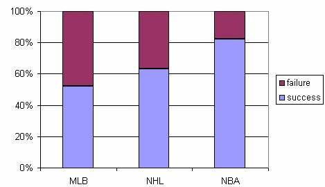
These summaries reveal that the home team is winning more than half the time in each league, suggesting a home team advantage in all three sports. While this advantage appears in all three leagues, we also detect a tendency for the NBA series to be won by the home team more often than the MLB and NHL series. In fact, MLB appears to have the weakest home field advantage.
To see if at least one of these proportions is significantly different from the other two, we use Minitab to determine the chi-square test statistic and p-value:
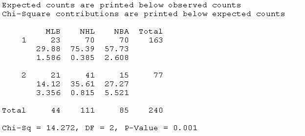
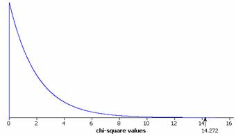
This procedure appears to be valid since all of the expected counts are at least 5 (smallest is 14.12). As discussed above we are also treating these samples as independent random samples from the playoff process in each league.
Since the p-value is small (.001 < .01) we will reject the null hypothesis and conclude that the probability of a seven-game series win by the home team differs in at least one of these leagues.
In an effort to say a little bit more, we can examine the chi-square contributions. We see that the largest contributions occur in the (MLB, 2) cell and the (NBA, 2) cell. The (MLB, 2) cell tells us that the observed number of 2’s (failures) was larger than expected and the (NBA,2) cell tells us that the observed number of failures is smaller than expected. This confirms our earlier observation that the probability of success appears to be higher for the NBA than for MLB.
In conclusion, we have pretty strong evidence (p-value = .001) that the probability of a home team winning a seven-game series is not the same across the 3 leagues. In particular, such a win seems more likely in the NBA than in MLB. However, we cannot draw a cause and effect conclusion since this was an observational study and we also need to be a little wary in extrapolating these results in years to come as there could be some change in the playoff series process that is not represented by these past records.
Scenario 3: Since we have two quantitative variables here (time to run one mile and number of push-ups), the appropriate analysis would be regression. However, we do not know much about how the sample was selected. It appears to be all students at a particular school and we must be very cautious in generalizing the results beyond this particular group of students.
We first want to examine numerical and graphical summaries. When you open PEClass.mtw you will notice that the mile run times have been recorded in “time format.” We want to convert this to numerical values. Choose Data > Change Data Type > Data/Time to Numeric. Specify C3 as the column to be changed and C4 as the storage location for the converted values. The data are now numeric, but in terms of a 24-hour day. To convert these back to minutes, type
MTB> let c5=c4*24
Now you should have the number of minutes (including the fraction of minute) for each student.
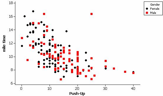
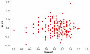
Since we aren’t considering either of these as a response variable, it does not matter which variable we denote as the y-variable and which as the x-variable. If we plot mile time vs. push-ups, we see there is a strong negative association.
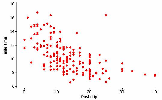
Students who do more push-ups also tend to run the mile in faster times. However, there is some evidence that the relationship is not linear. There is also an unusual observation, a student who did a larger number of push-ups but was one of the slowest runners. Carrying out the regression and examining residual plots confirms these observations.
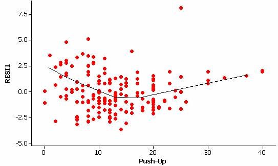
The residual vs. explanatory variable graph also reveals some differences in the amount of variation in the residuals at different values of the explanatory variable (indicating a violation of the constant variance condition).
It appears that transforming these data might be helpful. Since both distributions appear skewed to the right (if you looked at histograms of each variable individually), we could considering taking the log of each variable. The log-log scatterplot does appear more well behaved. (We have used log base ten but natural logs would also work.)
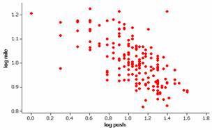
We still have some outliers but appear to now have a linear relationship. If we also examine the normality of the residuals:
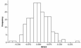
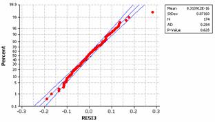
This condition also seems to be reasonably met for the transformed data. There is slight evidence of skewness to the right in the residuals but coupled with the large sample size we will not be concerned with this minor deviation.
The correlation coefficient for the transformed variables is
-.624, indicating a moderately strong negative linear relationship between log(time) and log(push-ups).
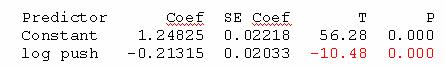
The least-squares regression equation is computed by Minitab to be ![]() = 1.23 - .213 log(push-ups). The
intercept coefficient here would indicate the predicted log-time for a student
who only completes 1 push up (so log(push-ups)=0) to
be 1.23. This corresponds to a time of
101.23 or about 17 minutes.
The slope coefficient predicts the average multiplicative change in the
log-mile times for each unit increase in log-push ups. A unit increase in “log push-ups” corresponds
to the push-ups increasing by a factor of 10.
So for each 10 fold increase in the number of push-ups (e.g., 1 push up
to 10 push ups), the mile time decreases on average by a factor of 10-.213
= .61. [Note: our prediction for 10
push-ups is 1.017, corresponding to 101.107 = 10.4 minutes, which is .61(17).]
= 1.23 - .213 log(push-ups). The
intercept coefficient here would indicate the predicted log-time for a student
who only completes 1 push up (so log(push-ups)=0) to
be 1.23. This corresponds to a time of
101.23 or about 17 minutes.
The slope coefficient predicts the average multiplicative change in the
log-mile times for each unit increase in log-push ups. A unit increase in “log push-ups” corresponds
to the push-ups increasing by a factor of 10.
So for each 10 fold increase in the number of push-ups (e.g., 1 push up
to 10 push ups), the mile time decreases on average by a factor of 10-.213
= .61. [Note: our prediction for 10
push-ups is 1.017, corresponding to 101.107 = 10.4 minutes, which is .61(17).]
If we test the significance of this correlation:
Let b represent the true population slope between log(time) and log(push-ups)
H0: b = 0 (there is not association between these two variables)
Ha: b ≠ 0 (there is an association)
We find a test statistic of t = -10.48 and a two-sided p-value of approximately 0.
Note: This p-value is the same as reported by Minitab with the sample correlation coefficient.
With such a small p-value (< .001) we would consider the relationship between log(time) and log(push-ups) to be statistically significant. While we need to have some caution in generalizing these results to other schools, we can eliminate “random chance” as an explanation for the strong log-log relationship observed in this sample.
If we wanted to use this model to carry out predictions, we need to keep the transformed nature of the variables in mind. For example, if a student completed 25 push-ups during that portion of the test, we would predict 1.23 -.213 log10(25) = .932 for the log-time and therefore 10.932 = 8.56 minutes for the mile time. We also need to start being a little cautious in predicting the mile time for such a large number of push ups as we do not have a large amount of data in this region and our estimate will not be as precise.
In summary, there is a strong negative relationship between number of push-ups and time to run a mile for this 7th and 8th graders as we would expect (those students who do more than the average number of push-ups will tend to be the same students who complete a mile faster, in a below average time). This relationship can be considered statistically significant after performing log transformations, however, we have to be cautious in generalizing these results beyond this sample as the students were not randomly selected from a larger population of junior high students. Since this is an observational study, we are not claiming that doing more push-ups will cause the mile time to decrease.
We also saw in an earlier example that there was a statistically significant difference between males and females on these tasks and we might want to consider incorporating that variable into our analysis as well. For example, a labeled scatterplot shows that the males tended to do more push-ups but were not noticeably different than the females in the mile times.