Stat 414 – HW 4
Due 8am, Monday, Oct. 20
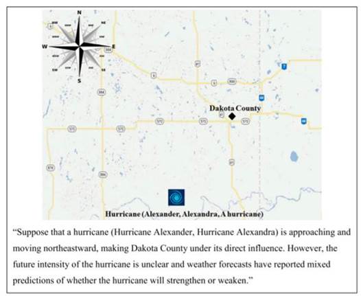
1) A study by Jung et al. (2014, “Female hurricanes are deadlier than male hurricanes,” Proceedings of the National Academy of Sciences in the USA, 111(24), 8782-8787) looked at hurricane names and their perceived threat. They thought that if hurricanes had male names they would be perceived as more dangerous than if they had female names. In one part of the study the participants were given a weather map showing a hurricane moving towards the area where they lived. Participants were told the name of the hurricane and rated the riskiness of the hurricane on a seven-point scale, with 1 being not at all and 7 being very risky. In Experiment 1, they used five male and five female names from the official 2014 Atlantic Hurricane registry.
(a) Examine the data in HurricaneNames1.txt.
hurr <- read.delim("http://www.rossmanchance.com/stat414/data/HurricaneNames1.txt", "\t", header=TRUE)
head(hurr)
What does each row represent?
(b) Produce a graph comparing the ratings given to the 10 hurricanes.
boxplot(hurr[, 2:11], col = c("blue", "pink", "blue", "pink", "pink", "blue", "blue", "pink", "pink", "blue")) #or improve on this code!
Is there preliminary evidence that hurricanes with male names are perceived to be more intense that hurricanes with female names?
(c) Explain why the following analysis would be inappropriate
avg_male = (hurr$Arthur + hurr$Cristobal + hurr$Omar + hurr$Kyle + hurr$Marco)/5
avg_fem = (hurr$Bertha + hurr$Dolly + hurr$Fay + hurr$Laura + hurr$Hanna)/5
t.test(avg_male, avg_fem)
(d) Convert the data into a new format.
library(tidyverse)
hurr2 <- hurr |>
pivot_longer(Arthur:Marco, names_to = "HurrName", values_to = "Score") |>
mutate(
HurrGend = factor(if_else(HurrName %in% c("Arthur","Cristobal","Omar","Kyle","Marco"),
"Male","Female")),
SN = factor(SN)
)
head(hurr2)
What does each row represent? In particular, explain what is in hurr2$HurrGend and in hurr2$SN. How many observations are in this dataset?
(e) Explain why the following analysis would be inappropriate
lm(Score ~ HurrGend , data = hurr2)
Is the p-value likely too large or too small?
(f) Carry out a “traditional” ANOVA on subject
summary(aov(hurr2$Score~as.factor(hurr2$SN)))
Is the F-test statistically significant? What does this tell you?
(g) Treat the subjects as fixed and estimate the significance of the hurricane gender on the rating
summary(lm(Score ~ 1 + HurrGend + SN, data = hurr2))$coefficients[1:10,]
Summarize the conclusion you draw from the t-statistic and p-value for HurrGender.
Now treat the subjects as random.
#library(lme4)
model0 = lmer(Score ~ 1 + (1 | SN), data = hurr2)
summary(model0)
(h) How many parameters are estimated in this model? (Identify them.) What are the estimates? (Be clear how you are finding them.) Provide an interpretation in context for each.
(i) Use model0 to calculate the intraclass correlation coefficient. Provide two interpretations of this value.
(j) Use the variance estimates to calculate the weight for the jth subject:
![]()
(k) Produce and summarize a visual illustrating partial pooling (e.g., what is represented by the grey, red, and black dots? Highlight cases with lots of shrinkage and highlight cases with little shrinkage? Explain why the amount of shrinkage appears to vary?)
subjectmeans <- hurr2 %>%
group_by(SN) %>%
mutate(SNmean = mean(Score)) %>%
ungroup()
fits = predict(model0)
ggplot(hurr2, aes(x=SN, y = subjectmeans$SNmean, group=SN)) +
geom_point() +
geom_point(aes(y=fits), col="red") +
geom_point(aes(y=Score), col="grey") +
theme_bw() +
geom_hline(yintercept = mean(hurr2$Score), col="black")
Next, we want to instead treat the subjects as random effects.
(l) Write out a model equation
(e.g., in terms of ![]() ’s and u’s) for model 0. Make sure all symbols and
subscripts are defined. Make sure you include the error distribution
assumptions.
’s and u’s) for model 0. Make sure all symbols and
subscripts are defined. Make sure you include the error distribution
assumptions.
(m) Run an analysis predicting the rating from the gender of the hurricane name, treating the subjects (SN = subject number) as random.
model1=lmer(Score ~ 1 + HurrGend + (1 | SN), data = hurr2); summary(model1, corr=F)
confint(model1)
(1) How large is a “typical within participant residual” in this model? (2) Interpret the 95% confidence interval for the hurricane name gender effect.
Note:
#There is a package folks use to get p-values with lmer, but some juries are still out on this…
#install.packages("lmerTest")
library(lmerTest)
summary(lmerTest::lmer(Score ~ 1 + HurrGend + (1 | SN), data = hurr2))$coefficients[1:2,]
We can use cross-validation to
formally demonstrate the benefits of random effects modelling. In particular,
we will remove individual data points (“leave one out cross-validation”), refit
the model, and see how well this model predicts the removed data value, summing
the prediction errors across all observations in the data set (aka the PRESS
statistic). The beauty of the leave-one-out approach, is you can use the leverage
values (hi) to get the predicted values without the ith
observation without actually refitting the model. Find the PRESS statistic ![]() for
complete-pooling, no-pooling, and “partial-pooling”:
for
complete-pooling, no-pooling, and “partial-pooling”:
model1NP=lm(Score ~ 1 + HurrGend + as.factor(SN), data = hurr2)
pe = (hurr2$Score - fitted(model1NP))/(1-hatvalues(model1NP))
sum(I(pe*pe)) #PRESS Statistic
sqrt(mean(I(pe*pe))) #square root of mean square prediction error
model1CP=lm(Score ~ 1 + HurrGend, data = hurr2)
pe2 = (hurr2$Score - fitted(model1CP))/(1-hatvalues(model1CP))
sqrt(mean(I(pe2*pe2)))
#install.packages("HLMdiag")
library(HLMdiag) #to get the leverage values for the random effects model
pe3 = (hurr2$Score - fitted(model1))/(1-leverage(model1)$overall)
sqrt(mean(I(pe3*pe3)))
(n) Summarize what you learn. Make sure it’s clear which is complete pooling, which is no pooling, and which is “partial pooling” (and how you can tell from the commands). Do the models compare as you would expect? Which model performs better and how are you deciding? Explain as if to a non-statistician.
(o) Suggest another variable about the hurricanes that you would be interested in including in the analysis (assuming it was available). Suggest another variable about the participants that you would be interested in including in the analysis (assuming it was available).
2) Recall that one of the questions of the 2014 European Social Survey was “All things considered, how satisfied are you with your life as a whole nowadays? Please answer assuming 0 = extremely dissatisfied and 10 = extremely satisfied.” We have data on 29 countries.
essdata <-load(url("https://www.rossmanchance.com/chance/stat414F22/data/ess5000.Rdata"))
essdata <- d
Optional: View(essdata) to get more information about the variables.
The commands below use tidyverse.
(a) Consider the following passage from a different study:
For each school in the study, all teachers at a particular time were selected; in other words, the sample was the full population of teachers for each school. If we restrict our attention to a particular school (as individual school reports did) it may seem that no question of sampling arises. However, it is unlikely that we would get the same observations if we were to hypothetically conceive of repeating the sample study. We recognise uncertainty in the measurement of human characteristics such as those involving teachers, and there is likely to be measurement error.
Statisticians deal with this by assuming we are in fact dealing with a sample from the hypothetically infinite superpopulation of all teachers who might conceivably have been teachers in this school. The idea is that it makes sense to make more abstract generalisations about this school than are governed by the situation and context of just one measurement occasion. Many current studies in education also use data collected on the full population of school children at a point in time, and will make inferences from this population about a superpopulation. Generally, we will assume that certain aspects of our data arise as if the study units were randomly drawn from some hypothetical population, even when we include the full actual population in our study.
Explain how this passage is relevant to this dataset.
(b) The following produces a graph of the life satisfaction distributions for the countries.
ggplot(essdata, aes(x=stflife, group = cntry, color = cntry)) +
geom_density() + theme_bw() + labs(x = "Life Satisfaction")
What would this graph look like if there was no “within country” variation? What would this graph look like if there was no “between country” variation? Which (within or between country) variation appears to be larger to you? (Justify your answer.)
(c) Fit a null model (model0) with random intercepts at the country level. Include your output and code. According to the ICC, which is larger, the between country variation or the within country variation? Is this consistent with what you saw in (b)?
(d) Suppose we want to know whether education increases life satisfaction (i.e., whether more education appears to correspond, on average, to higher life satisfaction scores). The education variable is on a 0-20 scale. What does the following R command do? What might this be helpful?
essdata <- essdata %>% mutate(edrange = eduyrs/20)
(e) Summarize what you learn from the following graph (Do some countries appear to have higher life satisfaction scores than others? Does there appear to be a relationship between education and life satisfaction? Does this relationship appear to vary across countries? Do you think the “overall relationship” between education and life expectancy is positive or negative? Justify your answers.)
ggplot(essdata, aes(x = eduyrs, y = stflife)) +
geom_jitter(alpha=.08, width=.2, height=.2) +
geom_smooth(method="lm", se=FALSE) +
facet_wrap(~cntry) + theme_bw() +
scale_y_continuous(limits = c(-.5,10.5), breaks = 0:10) +
labs(x="Years of education", y="Life satisfaction (0–10)")
Based on this list, I think IL = Israel and XK = Kosovo.
(f) Create a model (model1) that includes the edrange variable (include your code and output). Does this significantly improve the model? (include any new code and output)
(g) How much variation at Level 1 is explained by the edrange variable? (Show your work/output.) At level 2? Which is larger? Which did we learn more about – why some people are happier or why some countries are happier? (Hint: “Don’t confuse where a variable is measured with where a variable varies.”)
Create the group-mean variable for education:
essdata <- essdata %>%
mutate(aveed = ave(essdata$edrange, essdata$cntry ))
When we fit a model with ![]() and
and
![]() ,
the coefficient of
,
the coefficient of ![]() represents
the additional contribution at the country level.
represents
the additional contribution at the country level.
model2 <- lmer(stflife ~ 1 + edrange + aveed + (1 | cntry), data = essdata)
(h) Explain what you learn from
the sign of the coefficient of ![]() and
significance of this coefficient in this model.
and
significance of this coefficient in this model.
When we fit a model with ![]() and
and
![]() ,
the coefficient of
,
the coefficient of ![]() represents
the between-group effect.
represents
the between-group effect.
Create the “deviation variable” using the group means and fit model 3.
deved = essdata$edrange - essdata$aveed
model3 <- lmer(stflife ~ 1 + deved + aveed + (1 | cntry), data = essdata)
(i) Explain what you learn from
the sign of the coefficient of ![]() and
significance of this coefficient in this model.
and
significance of this coefficient in this model.