Stat 414 – HW 2
Due by midnight, Sunday Oct. 5
Please submit each problem as separate files in Canvas (doc or pdf format). You will need to install packages, including Tidyverse for this assignment.
1) R has some built in datasets. Let’s use state.x77. First figure out what the data are:
head(state.x77) (if this doesn’t work, try library(datasets))
?state.x77
(a) What are the observational units? What is measured by Murder and Illiteracy?
To use the data, convert to a data frame
statedata <- as.data.frame(state.x77)
(b) Fit a model (m1) to predict Murder from Illiteracy. Check the basic regression model assumptions (include relevant code and output). What do you learn? In particular, how would you describe the trend in the magnitude of the residuals vs. the fitted values?
(c) Take the log of Murder and fit a model with log(Murder) as the response variable and Illiteracy as the predictor (m2). Check the basic regression model assumptions (include relevant code and output). Note: It’s equivalent to use log base 10 or natural log, just be consistent if you back-transform. “Log” is R is actually natural log.
1. Has the linearity assumption improved or worsened? How are you deciding?
2. Has the normality assumption improved or worsened? How are you deciding?
3. Has the equal variance assumption improved or worsened? How are you deciding?
How do we decide if we want to transform x or y? If linearity is the only violated assumption, then probably transform x. If any of the distributional assumptions (i.e., normality, equal variance) are violated, then probability transform y. Often times, transforming y can fix multiple issues. Just be careful, if only one of them is violated, then the transformation could change other behavior and/or you may need to only transform x to maintain linearity. In the case where only equal variance is violated, that is also a good candidate for weighted least squares. Because the response variable is a rate, we expect more uncertainty for smaller states, so let’s make the weights proportional to the population size (larger states get heavier weights).
R code:
m3 <- lm(Murder ~ Illiteracy , data = statedata, weights = Population)
plot(m3)
Note: To compare these diagnostics to the unweighted model, you must use the standardized residuals. This is done in the Scale-Location plot but make the residuals vs. fits plot directly:
plot(rstandard(m3) ~ fitted(m3)
(d) Discuss whether you see any improvement in these plots with respect to the equal variance assumption.
(e) Compare the model summaries for m1 and m3. How has the slope coefficient changed? How has the residual standard error changed? Could you have anticipated either of these changes? Explain. Which model has a larger value for the standard error of the slope coefficient?
Another alternative is to adjust the standard errors of the coefficients directly based on where the model finds more variability (e.g., larger residuals).
(f) Find the standard error of the slope using sandwich estimators:
library(lmtest); library(sandwich)
coeftest(m1, vcov = vcovHC(m1, type = "HC1"))
Are the robust standard errors closer to the weighted or unweighted model?
(g) Discuss an advantage to using weighted regression over the robust standard errors.
2) A risk factor of cardiovascular disease is the “topography of adipose tissue” (AT). However, the only way to reliably measure deep abdominal AT is “computed tomography” which is costly, requires irradiation of the subjects, and is not available to many physicians. Depres et al. (1991) wanted to explore whether more easily available measurements (e.g., waist circumference, cm) could accurately estimate “deep” AT area (cm2). Their subjects were men from the Quebec City metropolitan area (recruited by “solicitation through the media”) between the ages of 18 and 42 years who were free from metazsbolic disease (e.g., diabetes, CHD) that would require treatment.
deepfat <- read.table("https://rossmanchance.com/stat414/data/deepfat.txt", header=TRUE)
head(deepfat)
scatter.smooth(deepfat$AT ~ deepfat$waist)
(a) Fit the least squares regression model and evaluate the residuals. Include the relevant code and output. What do you learn?
(b) Examine the “prediction bands”:
predictions <- predict(model1, newdata = data.frame(waist= deepfat$waist), interval = "prediction")
alldata <- cbind(deepfat, predictions)
ggplot(alldata, aes(x = waist, y = AT)) + #define x and y axis variables
geom_point() + #add scatterplot points
stat_smooth(method = lm) + #confidence bands
geom_line(aes(y = lwr), col = "coral2", linetype = "dashed") + #lwr pred interval
geom_line(aes(y = upr), col = "coral2", linetype = "dashed") + #upr pred interval
theme_bw()
Where are the confidence bands widest? Why?
If we ignore the slight bend in the
prediction bands, we can approximate the 95% prediction intervals with ![]() .
.
(c) Using this short-cut, estimate and interpret in context the 95% prediction interval for someone with waist = 50cm.
(d) Based on the original scatterplot, are you at all bothered by this prediction interval? Explain.
Again, we can consider weighted
regression as an alternative. Here the variability in the residuals appears to
increase with the waist values: ![]() .
This suggests using
.
This suggests using ![]() as
the weights (smaller weights to observations with larger waists).
as
the weights (smaller weights to observations with larger waists).
summary(model2 <- lm(AT ~ waist, weights = 1/waist, data = deepfat))
(e) How does the slope change between model 1 and model 2? Did the residual standard error change between model 1 and model 2? Explain why these changes make sense based on the original scatterplot.
Create the confidence and prediction bands for the weighted regression model:
predictions <- predict(model2, newdata = data.frame(waist = deepfat$waist), interval = "prediction", weights=1/deepfat$waist)
alldata <- cbind(deepfat, predictions)
ggplot(alldata, aes(x = waist, y = AT)) + #define x and y axis variables
geom_point() + #add scatterplot points
stat_smooth(method = lm) + #confidence bands
geom_line(aes(y = lwr), col = "coral2", linetype = "dashed") + #lwr pred interval
geom_line(aes(y = upr), col = "coral2", linetype = "dashed") + #upr pred interval
theme_bw()
(f) Where are the prediction bands widest? Why?
(g) How has the prediction interval for
waist = 50 changed? (using the graph)
(h) If you are worried about outliers, R has a built-in function for fitting Tukey’s resistant line:
line(deepfat$waist, deepfat$AT, iter=10)
plot(deepfat$AT ~ deepfat$waist)
abline(model1)
abline(line(deepfat$waist, deepfat$AT, iter=10), col="red")
How do the slope and intercept change?
Provide a possible explanation as to why they have changed this way, as if to a
consulting client. (Find and) Include a simple explanation of how this line is
calculated. Yes, I want you to do some investigation here. Cite your source(s). Bonus points if you paste in ChatGPT's answer and improve on it, discussing your improvements!
3) Data on unprovoked shark attacks in Florida were collected from 1946-2011. The response variable is the number of unprovided shark attacks in the state each year, and potential predictors are the resident population of the state and the year.
sharks <- read.table("https://rossmanchance.com/stat414/data/sharks.txt", header=TRUE)
head(sharks)
plot(sharks) #nice way to see all the bivariate associations at once
Examine the graph of the number of attacks vs. year. Because both equal variance and linearity are violated, this is a good candidate for transforming the response variable. Because the variability is increasing with number of attacks, let’s try taking the log.
sharks$lnattacks = log(sharks$Attacks + .5)
model2 <- lm(lnattacks ~ Year , data=sharks)
plot(model2)
(a) Why did I add 0.5 to every y-value?
(b) But how do we interpret the estimated slope coefficient with the transformed data? Consider two consecutive years:
![]()
![]()
1. What is the difference in the predicted values (formula)?
2. What do you know about the difference in two logged values? Use this relationship to talk about how the predicted number of attacks changes when year increases by one. If you use any additional references, be sure to cite them!
(c) Would you consider the equal variance condition met with model 2? Would you consider the linearity condition met with model 2? (Be sure to justify your answers!)
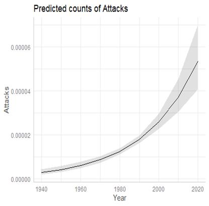
By the way, here is the fitted model:
(d) But we might still worry about assuming the errors and therefore the response variable at each x follows a normal distribution. What other probability distribution might we use for this count data whose variability increases with the mean?
Optional: Create year groups:
sharks$Year_coded <- factor(sharks$Year_coded, levels = c("45-55", "55-65", "65-75", "75-85", "85-95", "95-05", "05-15"))
ggplot(sharks, aes(x=Attacks)) + geom_histogram() + facet_wrap(~Year_coded)
What do these tell you about the normality assumption. (Try to be very precise in your wording here.)