Stat 414 –
HW 7
Due
midnight, Friday, Dec. 1
You don’t need to include
R code I give you but should include R code you create/modify and relevant
output.
1) Toenail dermatophyte onychomycosis (TDO) is a common
toenail infection where the nail plate becomes separated from the nail bed.
Traditionally, antifungal compounds have been used to treat TDO. New compounds
have been developed in an attempt to reduce the treatment
duration. The data in toenail.txt are from a randomized, double-blind,
multi-center study comparing two oral treatments ((Itraconazole and
Terbinafine) over a 3-month period, with measurements taken at baseline, every
month during treatment, and ever 3 months afterwards,
with a maximum of 7 measurements per subject.
At each visit, the target nail is coded as 0 (not severe, none or mild
separation) or 1 (moderate or severe = complete separation). The research questions
are whether the probability of severe infection decreases over time, and
whether that evolution differs between the two treatments.
#library(readr)toenail = read.table("https://www.rossmanchance.com/stat414/data/toenail.txt", header=TRUE)
toenail$ttmt = factor(toenail$ttmt)
(a) Explain what is measured by the time
variable in this dataset.
(b) Explore the data:
with(toenail,
round(tapply(y, list(ttmt,
time), mean), 2))
#there
is something wrong with interaction.plot,
so let’s use this instead
props = ave(toenail$y, by = list(toenail$time,
toenail$ttmt))
ggplot(data = toenail,
aes(y=props, x=time, group=ttmt,
col = ttmt)) +
geom_line() +
theme_bw()
Include the output and briefly summarize
what you learn. (Be clear what the y-axis represents in the graph.)
(c) First fit a model that treats the
observations on each individual as independent:
model1 = glm(y ~ time*ttmt, family = binomial,
data = toenail)
summary(model1)
Is the interaction close to significant?
How would you interpret the interaction in this context?
(d) Descriptively, how does the behavior
of the fitted model compare to that of the raw data?
ggplot(data = toenail, aes(y = fitted.values(model1), x = time, color = ttmt)) +
geom_line(aes(group=ttmt)) +
labs(title = "glm", xlab="time", ylab="estimated prop") +
theme_bw() + ylim(0, .5)
plot(effects::allEffects(model1))
(e) Now fit the multilevel model
model2 = glmer(y ~ time*ttmt + (1 | SubjID), family = binomial, data = toenail, nAGQ = 50)
#adaptive Gause-Hermite Quadrature, nAGQ = 50
summary(model2, corr=F)
#Include one of
the following graphs!
plot(effects::allEffects(model2))
fits =
predict(model2,re.form=NA,newdata=toenail)
#fixed effects only
fits=exp(fits)/(1+exp(fits)
#convert log odds to predicted probabilities
ggplot(data = toenail, aes(y = fits, x = time, color = ttmt)) +
geom_line(aes(group=ttmt)) +
labs(title = "mlm", xlab="time", ylab="estimated prop") +
theme_bw() + ylim(0, .5)
plot(ggeffects::ggpredict(model2, terms=c("time", "SubjID [sample=9]"), type="re"), ci = F)
Does this model suggest a significant
difference in the rate of decline between the two treatments? Explain how you
are deciding.
You may have noticed that these models
look pretty different. That’s because they estimate
different things! Previously, we interpreted the slope coefficient of a fixed
effect in a multilevel model as the “effect” of changing x-variables within a
specific group or “on average,” the marginal effect in the population.
With logistic regression models, the “within individual” rate of decline is not
the same as the “overall average” rate of decline (partly because of the
nonlinear back transformation). The slope of the marginal relationship applies
to a randomly selected person (population average). The slope of the
conditional relationship applies to a particular individual. The difference between these values increases
as the cluster curves are more spread out (larger variance of the intercepts).
One approach is the convert the
conditional (“subject specific”) slope to the marginal (think population
average) coefficient, with the equation:
![]()
(f) For the above model, what is the
marginal slope for time? Which is
larger here, the subject-specific slope or the population-average (group level)
slope? Does that make sense in context? Explain.
Alternatively, we can use generalized
estimating equations (GEEs) to come up with parameter estimates and robust
standard errors (think ‘sandwich estimators’).
First, fit a model with a “bad correlation structure.”
install.packages("gee")
model3 = gee::gee(y ~ time*ttmt, family =
binomial, data = toenail, id = SubjID,
corstr
= "exchangeable", scale.fix = TRUE, scale.value = 1)
summary(model3)
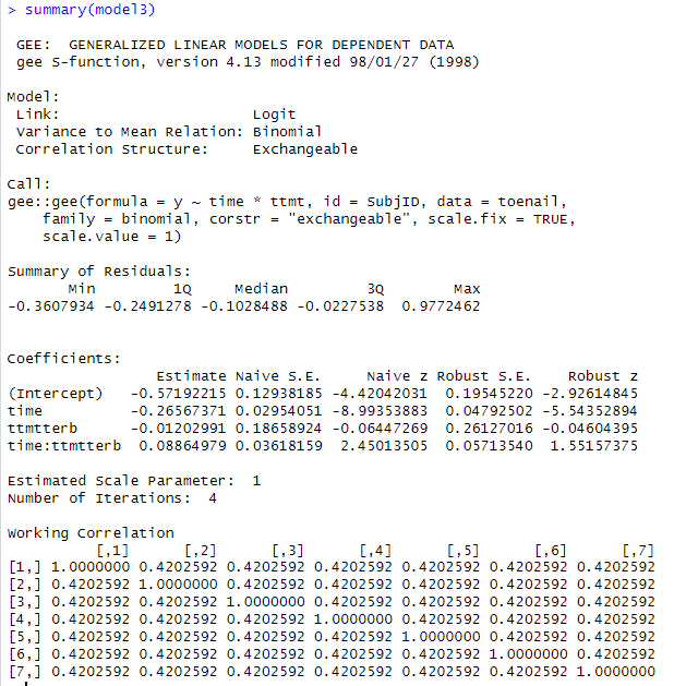
(g) Why do I consider the “working
correlation matrix” assumptions to be unreasonable in this context?
Now allow for a more appropriate
correlation matrix:
model4 = gee::gee(y ~ time*ttmt, family =
binomial, data = toenail, id = SubjID,
corstr
= "unstructured")
summary(model4)
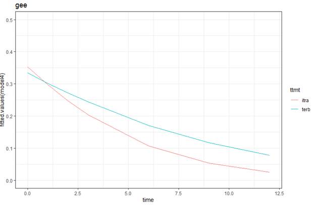
ggplot(data = toenail, aes(y = fitted.values(model4), x = time, color = ttmt)) +
geom_line(aes(group=ttmt)) +
labs(title = "gee", xlab="time", ylab="estimated prop") +
theme_bw() + ylim(0, .5)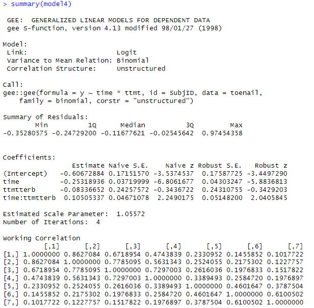
(h) What do you notice about the pattern
of correlations in the “working correlation matrix”? Is the correlation
modelled as the same between any two observations on the same individual? Does that make sense in this context?
(i) For models 3 and 4, how do the
“robust standard errors” (which ‘correct’ for the dependence in the data) compare to the “naïve standard errors”? Is this what we
expect to see? Explain. For which model are they more different?
(j) Which are closer to the observed
proportions of severe infections, the marginal (population-averaged) values or
the conditional (subject-specific) values?
head(fitted.values(model2), 10)
head(fitted.values(model4), 10)
Decent reference on GEEs
vs. MLMs
(k) Suggest a good candidate for a
“level 3” in this study.
2) In this exercise you will analyze data
from the Scotland Neighborhood Study (Garner and Raudenbush, 1991). This study
set out to test the hypothesis that a neighborhood's level of social
deprivation has a negative effect on a student’s educational attainment even
after controlling for the student’s prior attainment and family background. The data consist of 2,310 students who
attended 17 secondary schools and resided in 524 neighborhoods (for one “school
district”). Scottish secondary schools teach students from age 11-12 to the end
of compulsory schooling (age 15-16). The
response variable is a total attainment score (approximately standardized),
based on a series of national examinations (the GSCE) taken at the end of
compulsory secondary schooling in Scotland (age 16). Successful performance in
these examinations is a crucial factor in decisions regarding employment or
further post compulsory education possibly leading to entrance to universities.
Higher scores indicate higher attainment. Predictor variables include student
level verbal reasoning and prior reading attainment scores on entering
secondary education, a range of family level background characteristics, and a
neighborhood-level deprivation score.
install.packages("haven")
#to be able to open a STATA data file
library(haven)
GCSE <- read_dta("https://www.rossmanchance.com/stat414/data/GCSE.dta")
head(GCSE)
(a) Are these data purely hierarchical?
(e.g., are neighborhoods nested within schools?)
head(with(GCSE,
table(neighid, schid)), 20)
(b) Summarize what you learn from the
following commands (you may want to run parts of the commands/do further
exploration of the data to see what is going on, please document)
(library tidyverse)
schoolcombos<- GCSE %>% select(schid,neighid) %>% unique()
summary(tapply(schoolcombos$neighid, as.factor(schoolcombos$schid), length))
summary(tapply(schoolcombos$schid, as.factor(schoolcombos$neighid), length))
Hints: Maybe also consider
table(GCSE[GCSE$schid
== 0,]$neighid)
table(GCSE[GCSE$neighid == 29,]$schid)
(c)
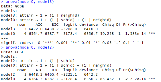
Fit
the null (unconditional) model with separate school random effects and
neighborhood random effects. (Model 0)
model0 = lmer(attain ~ 1 + (1|schid) + (1|neighid), data = GCSE, REML =
FALSE)
summary(model0)
Briefly
interpret the 3 variance estimates.
(d) Is the model with random effects a
significant improvement over the single-level model without random effects?
modelNR = gls(attain
~ 1 , data = GCSE, method = "ML")
summary(modelNR)
logLik(model0)
logLik(modelNR)
(e) Summarize what you learn from the
following output
(f)
Back
to your null model in (c). What percentage of variation is explained by each
component (i.e., variance partition coefficients or VPCs)? Are the “educational
disparities” larger among schools or among neighborhoods?
(g) To calculate the correlation between two
students (ICCs), you need to consider which components they share.
-
Two
students in the same school and neighborhood = ![]()
-
Two
students in the same school but different neighborhoods: = ![]()
What is the
formula for two students in the same neighborhood but different schools?
Calculate the
three ICC values. Which of these correlations is largest? Does this make sense
in context? Explain briefly.
(h) Examine the normality of each of the
random effects, e.g.,
qqnorm(ranef(model0)$schid[[1]])
qqnorm(ranef(model0)$neighid[[1]])
What do you
conclude/suggest next?
(i)
So
far, we have assumed “additive effects” for the schools and neighborhoods. Let’s consider a model that allows for an
interaction between the schools and neighborhoods.
Try something like: combos = paste(as.character(GCSE$schid), as.character(GCSE$neighid))
model1 = lmer(attain ~ 1 + (1|schid) + (1|neighid) + (1 | combos), data =
GCSE, REML = FALSE)
summary(model1)
anova(model0,
model1)
How many terms does this add to the
model? Is this model a significant
improvement over the additive model?
(Include relevant output and be clear how you are deciding.) Does the random interaction variance appear
substantial? (Include relevant output and be clear how you are deciding.) Provide a brief interpretation of the
implications of this interaction in context.
(j)
Now
add two measures of prior attainment: verbal reasoning (p7vrq) and reading
scores (p7read). Are these variables jointly significant? (Include relevant output and be clear how you
are deciding.) How much school-level
variance and how much neighborhood-level variance and how much Level 1 variance
is explained by these two variables?
What does it tell you if these variables explain any Level 2 variance?
(k)
Suggest
a potential school-level variable that could be included (not necessarily one
in the current data set). Suggest a
potential neighborhood-level variable that could be included (not necessarily
in the current data set).
3)
The U.S.
National Longitudinal Study of Youth (NLSY) original study
began in 1979 with a nationally-representative sample
of nearly 13,000 young people aged 14 to 21. CurranData.txt contains data from
a sub-study of children of the female NLSY respondents which began in 1986 when
the children were aged between 6 and 8 years. Child assessments (e.g., reading
scores) were then measured biennially in 1988, 1990 and 1992. The sub-sample of
221 children were assessed on all four occasions.
(a) Read
in two datasets. The first is in “wide
format” and the second is in “long format.”
What is the difference in these formats?
CurranDataWide <- read.delim("https://www.rossmanchance.com/stat414/data/CurranData.txt",
"\t", header=TRUE)
head(CurranDataWide)
CurranDataLong <- read.delim("https://www.rossmanchance.com/stat414/data/CurranData_Long.txt",
"\t", header=TRUE)
head(CurranDataLong)
(b) Look
at the first few rows in wide format.
Which are time-varying variables and which are
time-invariant?
(c)
Summarize what you learn from the
“spaghetti plot” (pick one to include)
library(tidyverse)
ggplot(data = CurranDataLong, aes(y = RAscore, x = Time)) +
geom_line(aes(group=id), color="light grey") +
geom_smooth(aes(group=1), color="black", size=1) +
theme_bw() +
labs(x="Years since 1986", y="Reading
Score")
OR
ggplot(CurranDataLong, aes(x = Time, y = RAscore, group = id)) +
geom_smooth(method = "loess", alpha = .5, se = FALSE) +
geom_smooth(aes(group=1), color="black") +
theme_bw()
(c)
Examine the correlations of the reading scores across the four time points.
(Explain what the R code is doing.) How
would you summarize their behavior? Explain why the pattern in the covariation/
correlation makes sense in this context.
cor(select(CurranDataWide,
contains("reading")))
(d)
If we were to fit an OLS model to these data, what assumption would this model
make about the correlations of the four observations on each person? Does that
assumption seem reasonable here?
(e)
Use lme (not lmer) to fit a
random intercepts longitudinal model (meaning, include Time). Tell me about the variable Time. Report
the intra-class correlation coefficient. What assumptions does this model make
about the correlations of the four observations on each person? Does that
assumption seem reasonable here?
library(nlme)
summary(model1 <- lme(RAscore ~ Time, random = ~1 | id, data = CurranDataLong))
cov2cor(getVarCov(model1,
type="marginal")[[1]])
(f)
Fit a random slopes model and examine the covariance matrix. Verify the values for var(y11)
= variance of “first observation” for person 1, var(y21) = variance
of “second observation” for person 1 (which can differ because we are using
random slopes), cor(1,2) = correlation of the first two measurements on each
person, cor(1,3) = correlation of first and 3rd
measurement on each person. (Show me the numbers!) How are the variances
changing over time? How do the correlations change as the observations get
further apart?
model2 = lme(RAscore ~ Time, random = ~Time|id,
data = CurranDataLong)
summary(model2)
getVarCov(model2, type="marginal")
cov2cor(getVarCov(model2,
type="marginal")[[1]])
fits = fitted.values(model2)
ggplot(data = CurranDataLong, aes(y = fits, x = Time)) +
geom_line(aes(group=id))
+
theme_bw()
(g) Return to the basic two-level random
intercepts model with time and time2 as Level 1 variables,
but without random slopes. Fit the AR(1) error
structure. Is this model significantly better than the “independent errors”
random intercepts model?
model4 = lme(fixed = RAscore ~ Time +
I(Time*Time), random = ~1| id, correlation = corAR1(), data = CurranDataLong)
summary(model4); intervals(model4)
cov2cor(getVarCov(model4,
type="marginal")[[1]])
model5
= lme(fixed
= RAscore ~ Time + I(Time*Time), random = ~1| id,
data = CurranDataLong)
anova(model5,
model4)
(h) What is the estimated parameter of
the AR(1) model (“autocorrelation”). How do you interpret it? Does there appear to
be correlation between adjacent observations even after conditioning on
student?
(i) How would we decide whether the
pattern of growth (i.e., reading progress) differs between males and females?
Explain the process, you don’t have to carry out.