Stat 414 – HW 2
Due by midnight, Friday, Oct. 6
This assignment still
includes some review material and a few things you may need to look up. Please
cite your sources.
Please submit
each problem as separate files in Canvas (doc or pdf format)
1) The file saldata.txt contains data on 24 college graduates, including their starting salary (in thousands of dollars), how many semesters they spent in college, and their major. (This isn’t read data but is based on real data :)).
saldata = read.table("http://www.rossmanchance.com/stat414/data/saldata.txt","\t", header=TRUE)
model1 <- lm(salary ~ semesters, data =
saldata)
summary(model1)
plot(saldata$salary ~ saldata$semesters)
(a)
Describe the association
between salary and time spent in college. Interpret the slope coefficient in
context.
(b)
Fit a model that
includes both salary and major.
summary(model2 <- lm(salary ~ semesters + major, data = saldata))
Provide an interpretation of the
coefficient of semesters in this model.
(c) Is major a statistically significant predictor of
salary after adjusting for number of semesters?
State
Ho and Ha, include an appropriate test statistic, and p-value. Interpret your
results in context. Be sure to include
any output you create to answer this question.
(d)
What
would you do differently if I asked you whether an individual’s number of
semesters significantly predicts salary after adjusting for major?
Let’s aggregate this information to the different
majors.
Majordata = aggregate(saldata[, 1:2], list(saldata$major),
mean)
head(Majordata)
plot(Majordata)
(e)
What
has this command done?
(f)
Find
the least squares regression model for these data and carefully interpret the
slope in context.
summary(model3 <- lm(salary ~ semesters, data = Majordata))
Now we want to fit a model that has both
of these variables, so we need to create a dataset that has both of these
variables. Try
newsaldata <- merge(saldata, Majordata, by.x="major", by.y="Group.1",
suffixes=c("",".G"))
head(newsaldata)
Now try
saldata$avgsem = ave(saldata$semesters, saldata$major)
head(saldata, 10)
with(saldata, plot(salary ~ semesters,
col = avgsem))
(g)
Now
fit
summary(model4
<- lm(salary ~ semesters + avgsem,
data = saldata))
Where have you seen the coefficient of
semesters before? Why?
(h) In model 4, how do we interpret the
coefficient of avgsem? (Hint: Why is it not the same as in (b)? Can you hold the other variable in the model
constant? How are this coefficient and the one in (f)
related?)
Now fit
summary(model5
<- lm(salary ~ semesters*avgsem,
data = saldata))
(i)
Provide
a detailed interpretation of the coefficient of the interaction. Hint:
What’s the difference between the graph below and if I made that graph for
model 4?
with(saldata, interaction.plot(semesters,
major, model5$fitted.values, type = "l"))
(j)
Is
the interaction statistically significant? (Cite your evidence.)
2) A risk factor of cardiovascular disease is the “topography
of adipose tissue” (AT). However, the
only way to reliably measure deep abdominal AT is “computed tomography” which
is costly, requires irradiation of the subjects, and is not available to many
physicians. Researchers wanted to
explore whether more easily available measurements could accurately estimate
AT. Their subjects were men between the
ages of 18 and 42 years who were free from metazsbolic
disease that would require treatment.
deepfat <- read.table("https://rossmanchance.com/stat414/data/deepfat.txt",
header=TRUE)
head(deepfat)
plot(deepfat)
#nice way to see all the bivariate associations at once
Fit the least squares regression model
and evaluate the residuals.
summary(model1
<- lm(AT ~ waist.cm., data = deepfat))
plot(model1)
(a) Interpret the R2 value in
context.
Note:
Here is another interesting relationship that holds for any number of
explanatory variables
cor(deepfat$AT, model1$fitted.values)^2
It appears the variability in the
residuals is increasing with the response variable (see increasing trend in 3rd
residual plot?). This suggests we could try a “variance-stabilizing
transformation” like log or square root.
Try taking the square root of the response.
sqrtAT = sqrt(deepfat$AT)
summary(model2
<- lm(sqrtAT ~
waist.cm., data = deepfat))
plot(model2)
(b) Does this help the unequal variance
assumption? Justify your answer.
Of course, transforming one variable can
impact the form of the association. An
alternative to a variable transformation, when the only issue is heterogeneity,
is weighted least squares. For this
problem, model the variability as a function of the explanatory variable (and
use the standardized residuals in the residual plot).
summary(model3
<- lm(AT ~ waist.cm., weights = 1/waist.cm., data = deepfat))
plot(rstandard(model3)~fitted.values(model3))
(c) How does the slope change? Did the
residual standard error change? Explain
why these changes make sense based on the original scatterplot.
(d) Create prediction intervals and
confidence intervals for model 1:
predict(model1,
newdata = data.frame(waist.cm.
= 100), interval = "prediction")
predict(model1,
newdata = data.frame(waist.cm.
= 100), interval = "confidence")
Write a one-sentence interpretation for
each interval.
(e) Try this code
predictions <- predict(model1, newdata
= data.frame(waist.cm. = deepfat$waist.cm.), interval
= "prediction")
alldata <- cbind(deepfat, predictions)
ggplot(alldata, aes(x = waist.cm., y =
AT)) + #define x and y axis variables
geom_point()
+ #add scatterplot points
stat_smooth(method
= lm) + #confidence bands
geom_line(aes(y = lwr), col =
"coral2", linetype = "dashed") +
#lwr pred interval
geom_line(aes(y = upr), col =
"coral2", linetype = "dashed") +
#upr pred interval
theme_bw()
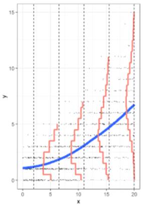
Where are the confidence bands widest?
Why?
(f) How does the prediction interval
compare to ![]() ? (Show
your work)
? (Show
your work)
(g) Repeat (e) for the weighted
regression.
predictions <- predict(model3, newdata
= data.frame(waist.cm. = deepfat$waist.cm.), interval
= "prediction", weights=1/deepfat$waist.cm.)
alldata <- cbind(deepfat, predictions)
ggplot(alldata, aes(x = waist.cm., y =
AT)) + #define x and y axis variables
geom_point()
+ #add scatterplot points
stat_smooth(method
= lm) + #confidence bands
geom_line(aes(y = lwr), col =
"coral2", linetype = "dashed") +
#lwr pred interval
geom_line(aes(y = upr), col =
"coral2", linetype = "dashed") +
#upr pred interval
theme_bw()
Describe and explain the main change.
(h) If you are worried about outliers, R
has a built-in function for fitting Tukey’s resistant line:
line(deepfat$waist.cm.,
deepfat$AT, iter=10)
plot(deepfat$AT
~ deepfat$waist.cm.)
abline(model1)
abline(line(deepfat$waist.cm.,
deepfat$AT, iter=10),
col="red")
How does the slope and intercept
change? Provide a possible explanation
as to why they have changed this way, as if to a consulting client. (Find and)
Include a simple explanation of how this line is calculated. Yes, I want you to
do some investigation here. Cite your source(s).
3) Poisson regression
What
do I do with count data, which is often skewed to the right and the variability
increases with the mean?
Data
on unprovoked shark attacks in Florida were collected from 1946-2011. The
response variable is the number of unprovided shark attacks in the state each
year, and potential predictors are the resident population of the state and the
year.
(a)
Create a graph of the number of attacks vs. year and vs. population. Do the graphs behave as expected: Do the conditional distributions appear
skewed to the right? Does the variability in the response seem to increase with
the number of attacks? Do the residuals show any issues with the linear model?
sharks
<- read.table("https://rossmanchance.com/stat414/data/sharks.txt",
header=TRUE)
head(sharks)
plot(sharks) #nice way to see all the
bivariate associations at once
sharks$Year_coded
<- factor(sharks$Year_coded, levels =
c("45-55", "55-65", "65-75", "75-85",
"85-95", "95-05", "05-15"))
#tidyverse
ggplot(sharks,
aes(x=Attacks)) + geom_histogram()
+ facet_wrap(~Year_coded)
model1 <- lm(Attacks
~ Year, data=sharks)
plot(model1)
Instead
of assuming the conditional distribution are approximately normal, we can model
them as Poisson distributions. The extension of the basic linear regression
model is the general linear model. The Poisson regression model fits the
model
![]() where the
observed yi values
are assumed to follow a Poisson distribution.
The log transformation here is referred to as the “link function” and
expresses how the response is linearly related to the explanatory variable.
We’ve been doing a special case, the “identity” link and the normal
distribution for the errors.
where the
observed yi values
are assumed to follow a Poisson distribution.
The log transformation here is referred to as the “link function” and
expresses how the response is linearly related to the explanatory variable.
We’ve been doing a special case, the “identity” link and the normal
distribution for the errors.
(b) Fit a Poisson regression model to these data.
model2 <- glm(Attacks ~ Year + Population, data=sharks, family=poisson)
summary(model2)
ggplot(sharks,aes(x=Year,y=Attacks))+geom_point()+
geom_line(aes(y=exp(predict(model2)))) +
theme_bw()
Interpret the coefficient of Year in this model.
Extra Credit: How do we the slope when the response has been
log transformed? (See handout in Canvas)