Stat 301 –
HW 7
Due
midnight Friday, March 8/Saturday
Remember to submit each problem as a separate file and
to put your name(s) inside each file and, if submitting together, join a HW
group before you submit. Remember to show your
work/calculations/computer details (even if not specifically asked) and to
integrate this into the body of the solution. Repeat to check back on this page
through the week for possible updates/clarifications to the questions.
1) Facebook
News Feed filters content to reduce the amount of information presented at
once. Facebook uses an algorithm that aims to identify the content that is
most relevant and interesting. Kramer, Guillory, and Hancock (2014) examined data from Facebook on whether
people who post on Facebook respond differently depending on the level of
emotional content expressed in the News Feed of their friends. To collect
the data, Facebook manipulated how much positive and how much negative content
was shown in the feed (to people who viewed Facebook in English). In one
part of the experiment, the exposure to positive emotional content was reduced,
and in the other the exposure to negative emotional content was reduced. Both
parts included a control condition in which a similar proportion of posts were
omitted at random. The experiments took place for one week (January 11–18,
2012). Participants were randomly selected based on their User ID,
resulting in a total of approximately 155,000 participants per condition
(689,003 participants overall) who posted at least one status update during the
experimental period. At the end of the study period, the researchers recorded
the percentage of all words produced by a person during the experiment that was
positive, and the percentage of all words that was negative.
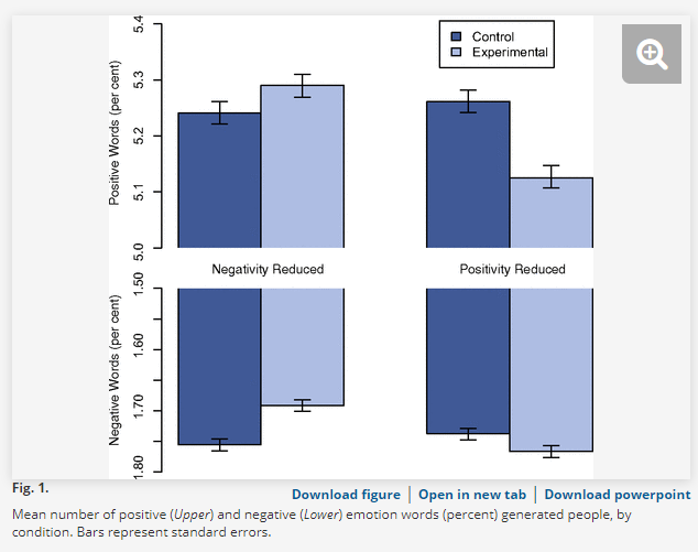
(a) Identity the observational unit in
this study.
(b) Describe two explanatory variables
in this study. Classify each variable as quantitative or categorical.
(c) Describe two response variables in
this study. Classify each variable as quantitative or categorical.
(d) Cite one disadvantage to these
graphs compared to dotplots, histograms, or boxplots.
(e) Suggest one improvement you would
make to the current display to better tell the story in the data.
(f) Summarize the relationships revealed
by these four graphs, in context. (Even without access to the raw data.)
(g) Based on the bars representing
standard errors, do you think any of the differences between the control and
experimental groups are statistically significant for any of the four
conditions?
(h) Are you willing to generalize to all
Facebook users? Why or why not? Are you
willing to draw cause-and-effect conclusions? Why or why not?
(i) Do you
have any issues with the ethical nature of this study?
2)
For the study
on elephants’ walking distances, we considered the two groups of elephants as
random samples from their respective populations. We considered these
populations to be large, but had no access to the actual population data. The
sample distributions were not particularly normal and the sample sizes were not
particularly large, so this meant we were a little skeptical about the validity
of the t-procedures. One way to investigate the feasibility of the
CLT for these data is bootstrapping. When we are carrying out a test of
significance, we can pool the two samples together and resample from that
larger group, once for each group, matching the original sample sizes.
Open the Two sample bootstrapping applet.
Type in elephants.txt (press Use Data twice) or paste in the elephant data in the
Sample data box on the left and press Use
data. Confirm the values for the sample means and standard deviations.
Check the Show Sampling Options box. Use the Difference in Means as the statistic. Check the Pooled box.
(a) Specify at least 1000 for the Number
of Samples and press Bootstrap Samples.
Include a screen capture of the resulting bootstrap distribution. Where is this distribution centered? Why
(roughly)? Does this distribution look approximately normal?
(b) Change the statistic to the t-statistic
and examine the bootstrap distribution. Check the box to Overlay t
distribution. Is it a good match? Enter
the observed value of the t-statistic and find the two-sided p-value
from both the simulation and the t-distribution. Include a screen
capture. Does this confirm that the t-test
can be considered valid for these data?
Explain.
One large benefit of bootstrapping is it
works with statistics other than differences in sample means (where we have
some theory).
(c) Use the pull-down menu to choose the
difference in sample medians. Report a two-sided p-value. (Include a screen capture.) How does the
p-value for comparing the medians compare to the p-value for comparing the
means? Which p-value is smaller? Why does the p-value change and why in that
direction?
For a confidence interval rather than a
test of significance, we don’t have to pool the two samples together. Instead,
we can resample from each sample independently and then calculate the
statistic.
(d) Uncheck the Pooled box and change
the Number of Samples back to 1 (Keep the difference in medians as the
statistic.) Specify at least 1000 for
the Number of Samples and press Bootstrap Samples again. Include a screen capture of the resulting
bootstrap distribution.
·
Does
this distribution look approximately normal?
·
How
does the standard deviation compare to (c)? Which is larger – try to explain
why.
(e) Use the bootstrap distribution you
created to create an informal 95% confidence interval (show your work). Include a one-sentence interpretation of your
interval. (Hint: What is the parameter?)
3) To investigate a
possible association between violent video games and aggressive behavior,
British researchers Hollingdale and Greitemeyer (2014) randomly assigned 49
students from a university in the United Kingdom to play Call of Duty: Modern Warfare (a violent video game) and 52 students
to play LittleBigPlanet 2 (a
nonviolent/neutral video game). After 30 minutes of playing the video games,
the subjects were asked to complete a marketing
survey investigating a new hot chili sauce recipe. They were told they were to
prepare some chili sauce for a taste tester and that the taste tester “couldn't
stand hot chili sauce but was taking part due to good payment.” They were then
presented with what appeared to be a very hot chili sauce and asked to spoon
what they thought would be an appropriate amount into a bowl for a new recipe.
The amount of chili sauce was weighed in grams after the participant left the
experiment. The amount of chili sauce (fluid ounces) was used as a measure of
aggression: the more chili sauce, the greater the subject’s aggression.
(a) Select the VideoAgression data from the pull down menu in the Comparing Groups (Quantitative) applet. Check the Show overall box and note the standard deviation.
(b) Screen capture the numerical and graphical
summaries of the data comparing the two groups.
Summarize what you learn about the shapes, centers, and spreads of each
group.
(c) Consider the “pooled SD” (11.98) as an estimate of the “within treatment” standard deviation in chili sauce amounts (the “unexplained” variation after accounting for the treatment). What is the percentage change in the variances (larger variance (before) – smaller variance (after))/larger variance x 100%? Keep in mind that variance = standard deviation2. (Show your work) Interpret this value in context: _____% of the variance in is explained by which treatment they were in.
(d) In words, state appropriate
null and alternative hypotheses to test whether there is an association between
type of video games and level of aggression.
(e) Carry out a randomization test for these data. (Use 10,000 shuffles, might take a second 😊. Note: R won’t do the exact distribution for me because the sample size is too large!) Include a screen capture of the resulting null distribution with the p-value shaded. Also note the mean and standard deviation of this null randomization distribution. Summarize the conclusions you would draw in terms of significance, causation, and generalizability.
(f) Do you think two-sample t-procedures are likely to be valid with
these data? Justify your answer.
(g) Use the pull-down menu to select the
t-statistic. Report the observed value of the t-statistic for the
actual study (this is unpooled if you want to verify its value) and use it to
determine the simulation-based and
the t-distribution-based p-values (check the Overlay t box).
Include a screen capture. How do they p-values compare? Does the t-test
appear to be valid for these data?
(h) Calculate (you can use the applet’s
checkbox in the lower left corner of the page) a 95% confidence interval for
the difference in the treatment means. Carefully interpret your interval (Hint:
What is the parameter?)
(i) Calculate the “independent samples”
unpooled standard error for the difference in sample means. (Show your work.)
(j) The randomization distribution
assumes the null hypothesis is true, so we could also use
where s is the standard deviation
of all 101 observations. Calculate this
value and then conclude which standard error estimate is closer to the
simulation results.
Note:
Instead of worrying about changing the SD formula, we will trust in the t-distribution
to make the right adjustments (uses a bigger denominator because has more of
the bigger differences than might predict)!
4)
Reconsider the water usage data that you supplied earlier this quarter, where
we were a little flummoxed by the strange behavior, and not very close to the
national average of 1744 gallons/day.
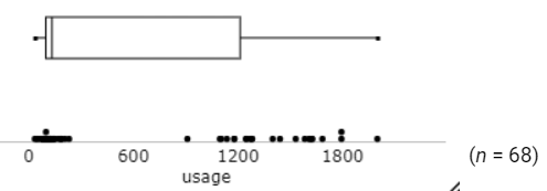
Turns
out, there were two kinds of people in the sample: those who followed the
poorly written instructions (on HW 2) and those who did not.
![]()
So
I have created a new variable “length” which labels the respondents as filling
out the “short” version of the survey (rows 2-15) vs. the “long” version of the
survey (all rows)!
Paste
the waterusagelength.txt data into the Comparing Groups
(Quantitative) applet.
If
someone doesn’t answer the last 4 questions, the national average for the
remaining questions is 54 gallons/day, a difference of 1690 gallons/day. So let’s let ![]() represent the difference in the population
mean water usage between the long version and the short version of the water
usage survey I gave. We want to test
represent the difference in the population
mean water usage between the long version and the short version of the water
usage survey I gave. We want to test ![]() to
see whether this explains the clusters in our data. Let’s first visualize this in the applet.
to
see whether this explains the clusters in our data. Let’s first visualize this in the applet.
·
Check
Show Shuffle Options
·
Use
the difference in means as the statistic
·
Set
the Number of Shuffles to 1.
·
Specify
-1690 as the hypothesized difference (note the change in the direction
of subtraction)
·
Select
the Plot display
·
Press
Shuffle Responses
(a) Explain in your own words what this
animation is doing and why (Hint: How is it “assuming the null
hypothesis is true”?)
(b)
Set
the number of Shuffles to 1000 and generate the randomization distribution of
the difference in sample means.
Include a screen capture. What is roughly the mean of this randomization
distribution? Why?
(c)
Generate
a two-sided p-value (include a screen capture). What conclusion do you draw in
context?
(d) The two-sided p-value only allows us to
conclude “there is a difference.” On the
far left/bottom of the applet, check the 95% CI(s) for difference in means
box. Interpret the interval in
context. Hint: Does the difference
between the two groups tend to be larger or smaller than 1690? What does this
tell us?
Water Usage continued:
(e) Review the water usage survey.
Fill in your values from before (how ever you did so before, with rows 16-20 or
not). Now, decide one change in behavior
that you realistically could carry through with to lower your water
footprint. Make this change in the
google sheet and note the new water usage.
Use this form (Water
Usage Survey II in Canvas) to report your values for cell F21.